
FREEU
The client came with a bold mission: to launch a line of menstrual underwear that felt liberating and empowering. With no name, concept, or identity in place, the challenge was to build a brand from scratch that could stand confidently on its own while remaining connected to the parent activewear line.
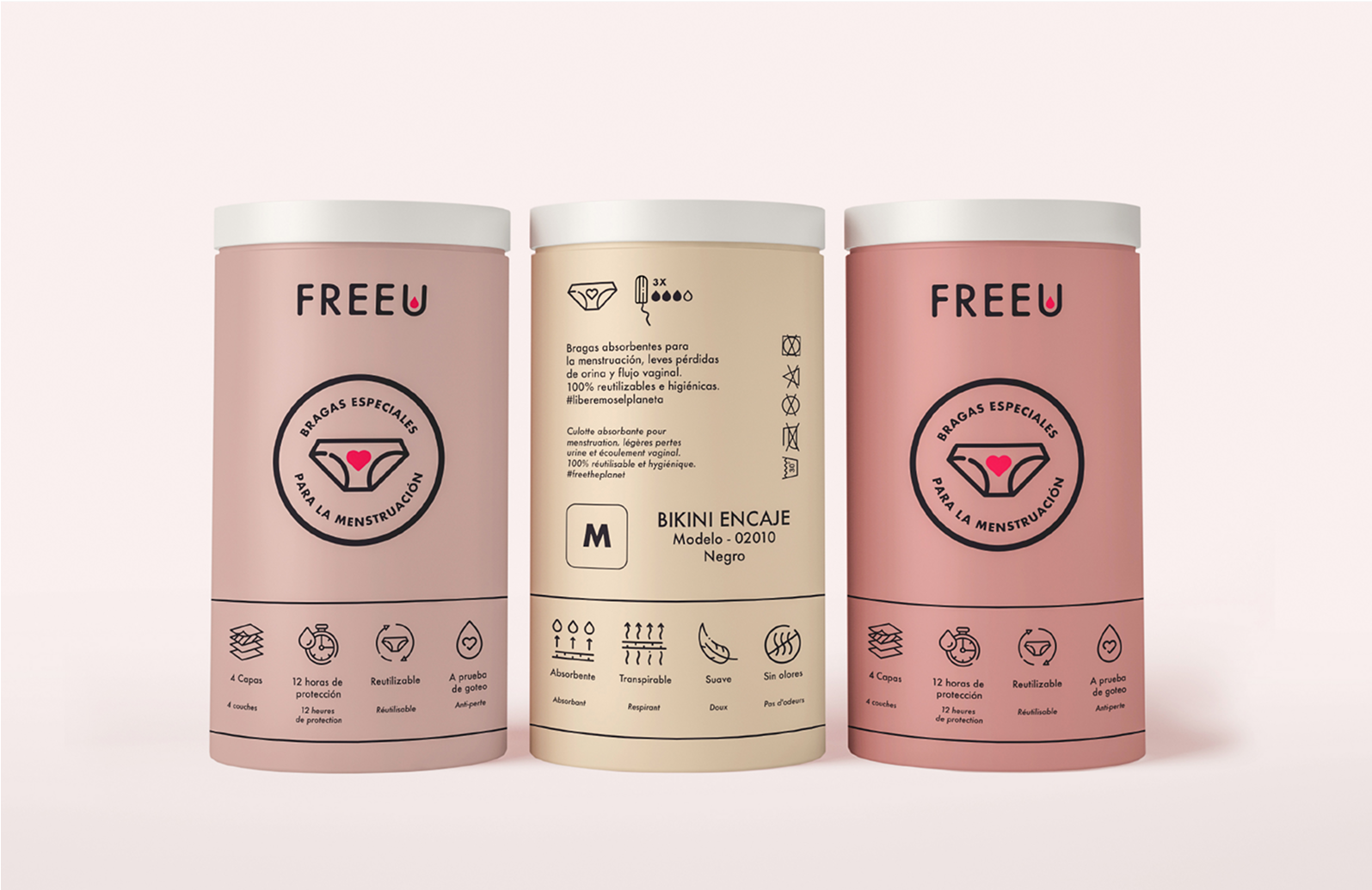
I design a brand built on one strong idea: liberation. That’s how FreeU was born, an English name that feels accessible, direct, and meaningful. It invites wearers to feel free in their bodies, even on their period. From that starting point, I developed a visual identity that is bold yet gentle. The logo features a symbolic drop of blood within the letter “U”, representing protection, transparency, and empowerment. The color palette reflects the cyclical nature of menstruation with warmth, softness, and clarity.
Wellness & Feminine Health
INDUSTRY
Naming • Brand Concept • Visual Identity • Collateral Design
SERIVCE
Creative Direction • Brand Concept • Market Research • Logo Design
SKILLS